Vielka d' Seguros
- Project Management, Branding and Web Design
- Adobe Photoshop, Adobe Illustrator, Adobe InDesign, WordPress
- San José, Costa Rica
Vielka d’ Seguros is a trusted SME with over 25 years of experience in Costa Rica’s insurance sector. I led a branding and web design project to establish their visual identity and enhance their user experience, focusing on clarity, professionalism, and client trust.


The Foundation
The owner of Vielka d’ Seguros began as an independent agent, steadily growing her client portfolio over the years. As the business evolved, she recognized the need to establish a strong brand.
After an initial discovery phase, I collaborated with the client to define her North Start. Vielka d’ Seguros is guided by a clear mission: to offer comprehensive service by providing clients with the best insurance options tailored to their needs, ensuring the protection of their assets. Their vision is to become a leader in the insurance industry by fulfilling their role as a trusted intermediary—delivering accurate, in-depth advice on risk and policy management at every stage, from policy issuance and collection to renewal and claims support.
The client wanted her brand to reflect the core values of security, trust, and knowledge, qualities that have defined her work throughout the years. Equally important to her was conveying a sense of elegance, ensuring that clients feel both confident and valued from the very first interaction with the brand, particularly across her new touchpoints (website, social media, email, and business stationary).
With the North Star defined, the next step was to translate our audience into actionable segments. I developed two core UX Personas: one representing individual clients seeking personal insurance solutions, and the second representing SME owners looking for tailored business insurance.

Julio "The easygoing Doctor"
38 • Married • Pediatrician • Heredia, Costa Rica
“I need to renew my car insurance, but this time, I don’t want to deal with a big insurance company.”

Ana "The Coffee Lover"
30 • Single • Cafe Owner • Escazú, Costa Rica
“I put my heart and soul into this cafe, I want an insurance company that understands me.”
Designing the Brand
For the visual identity, a refined color palette centered around navy blue and dark gold to convey security, trust, and sophistication. These core colors are complemented by subtle accent tones to add depth and visual interest across the brand materials. A clean, contrasting font color was selected to ensure readability and maintain a polished, professional look throughout both digital and print applications.
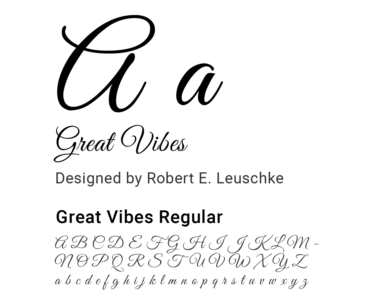
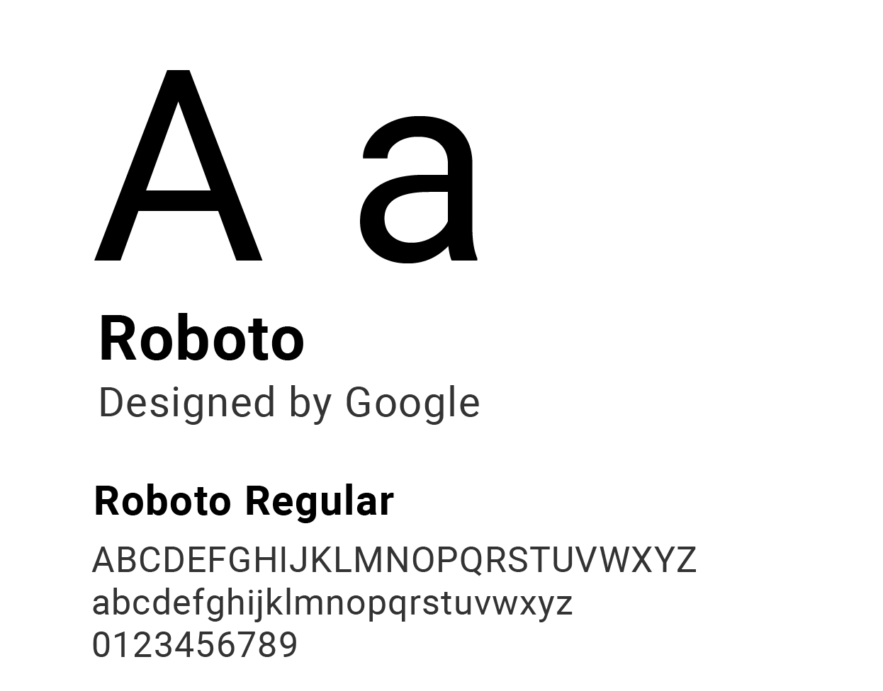
For the brand’s typography, Roboto was selected for both body text and titles, offering a clean, modern look with excellent readability across digital platforms. For the logo, the client wanted a cursive style that felt modern and fresh while still maintaining a sense of professionalism. We chose Great Vibes, which adds a touch of elegance and personality to the brand without compromising its credibility.
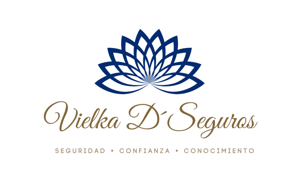
The logo features a navy blue lotus, symbolizing security and stability, paired with a golden brand name that conveys trust and knowledge. Its elegant design reflects the professionalism and refined identity of the brand.





Website Design
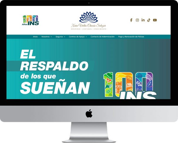
The launch of the Vielka d’ Seguros website was a pivotal moment, marking the company’s first-ever online presence. Recognizing the importance of a strong first impression, every element was crafted for intuitive navigation and a welcoming user experience. Imagery was carefully selected to instantly convey security, trust and knowledge, reinforcing the brand’s core values. The result is a digital foundation that successfully introduces Vielka d’ Seguros to the market and immediately positions them as a modern, client-focused leader in the insurance industry.
As the project lead for Vielka d’ Seguros’ debut website, my role extended beyond the visual identity. I collaborated closely with the client to design the site’s structure, ensuring ease of navigation and a professional user experience. Crucially, I also guided them through the copywriting process, helping to refine the language and tone. This ensured the final text—from service descriptions to calls-to-action—was clear, consistent, and directly reinforced the brand’s core values of trust and client focus, culminating in the authoritative digital presence the company needed.
Business Stationary
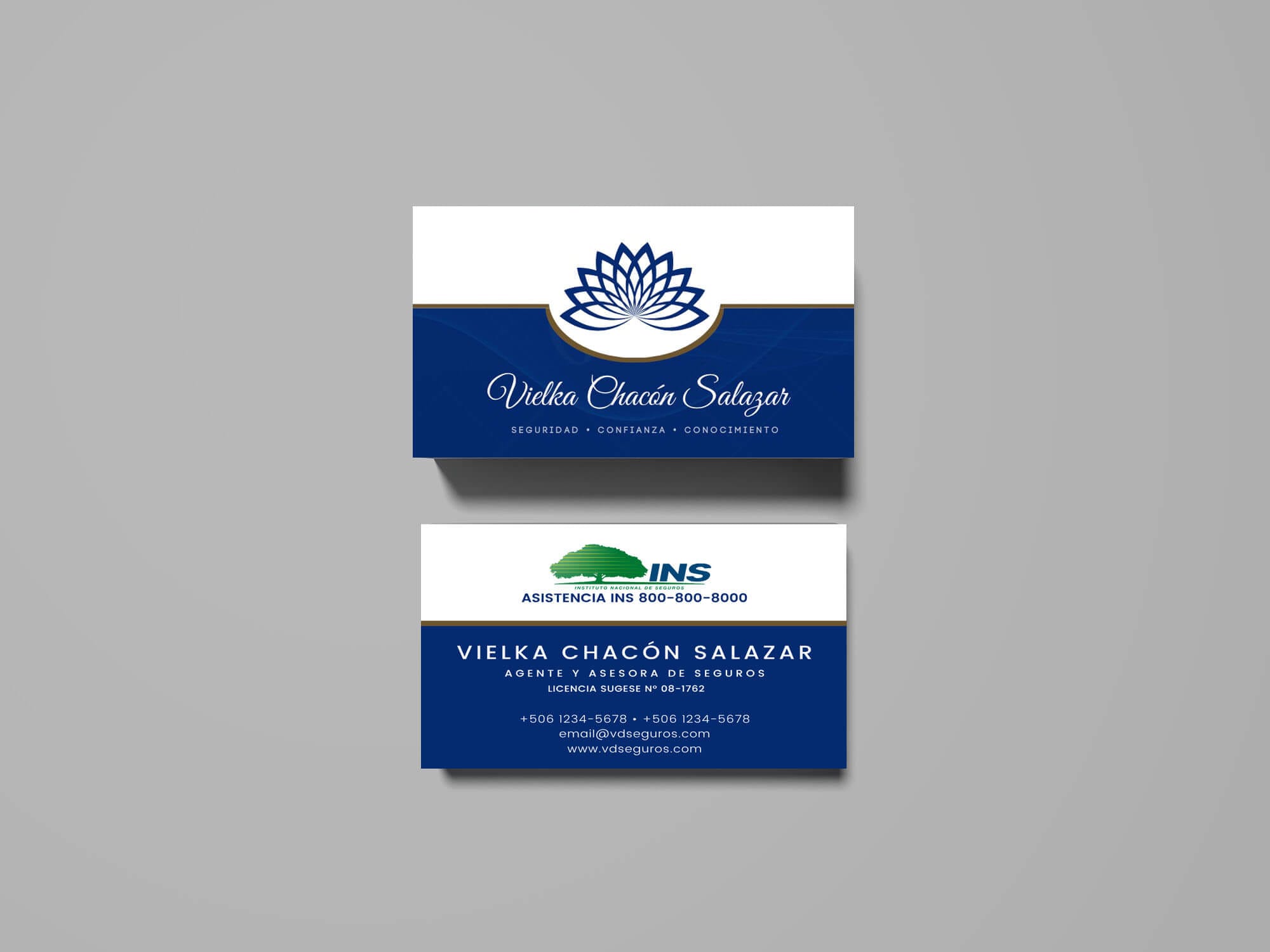
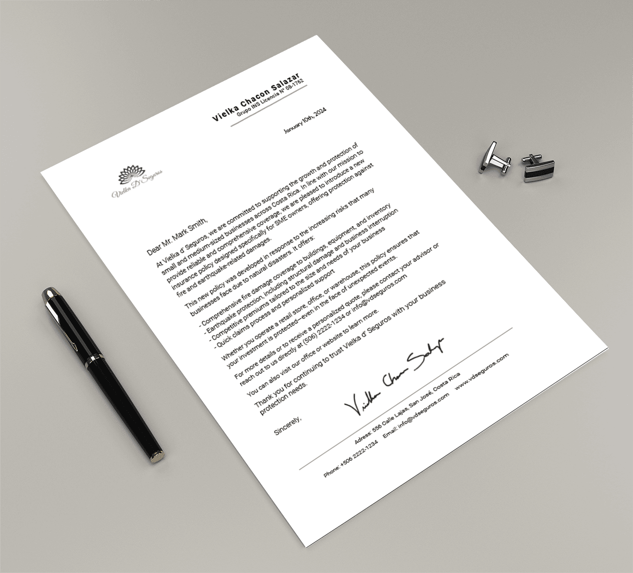
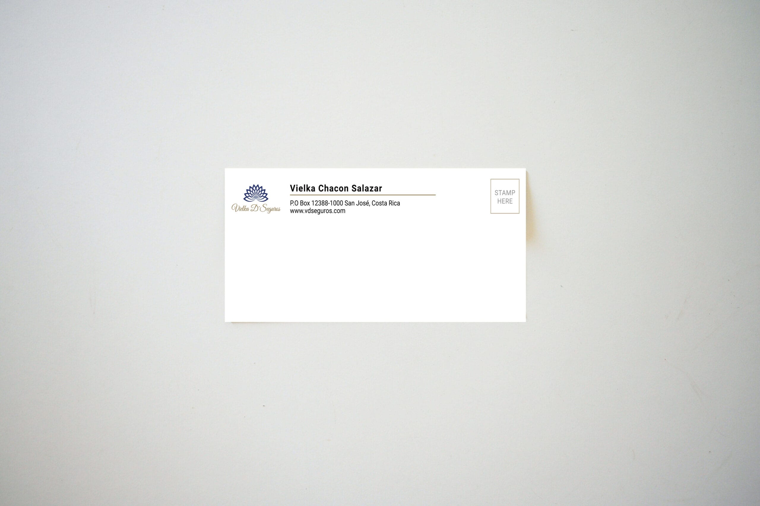
A cohesive set of branded materials was designed including a business card, letterhead, envelope, and corporate seals, all tailored to reflect the client’s professional identity and values. The goal was to create a polished and consistent visual language across all touchpoints, reinforcing brand recognition and credibility. Each piece was thoughtfully designed with attention to typography, layout, and color to maintain clarity and elegance. The business card delivers a strong first impression, while the letterhead and envelope ensure brand consistency in formal communications. The corporate seals add a layer of authenticity and professionalism, ideal for official documents and client interactions.

