Pre-Columbian Gold Museum
Álvaro Vargas Echeverría
- Redesign Project
- Adobe Photoshop, Adobe Illustrator, Adobe InDesign
- San José, Costa Rica
The Pre-Columbian Gold Museum possesses an extraordinary archaeological collection and it is located within one of the most iconic buildings in Costa Rica – it is a subterranean building below Plaza de la Cultura. I redesigned their brand and part of its website (homepage and about) to improve the user experience.

The Challenge
Redesigning the branding and website of the Pre-Columbian Gold Museum requires a thoughtful approach that honors its rich cultural heritage while embracing modern design principles. The new branding should reflect the museum’s unique collection of ancient artifacts, highlighting the craftsmanship and history behind the goldwork.


Designing the Brand
After researching the museum’s history, architecture, and curatorial narrative, I identified three core elements to anchor the rebrand:
Geometry: The equilateral triangle is a foundational design unit within the museum, visible in both floor and ceiling grids.
Narrative: The museum experience guides visitors through a journey from past to present, highlighting how both shape Costa Rica’s future.
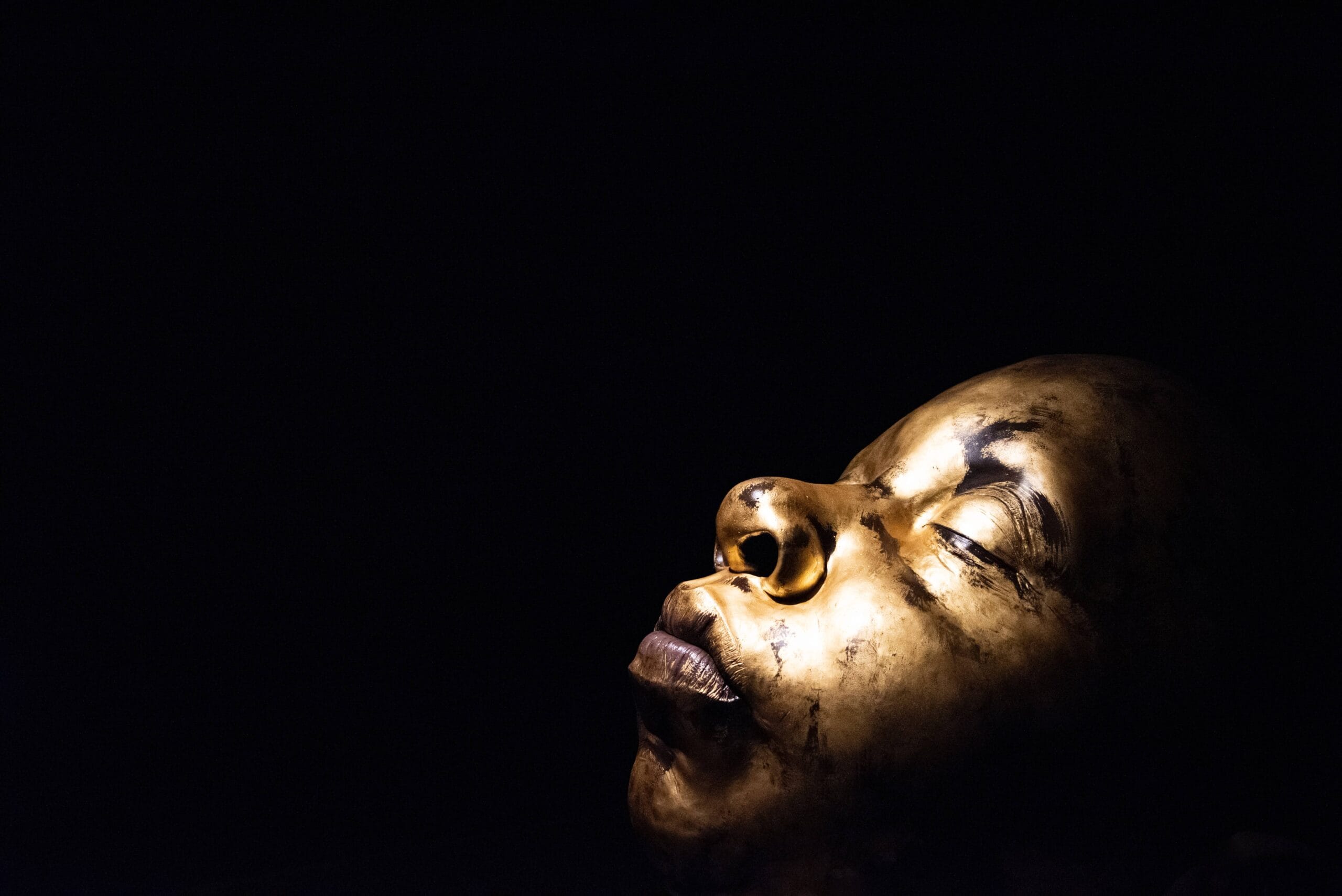
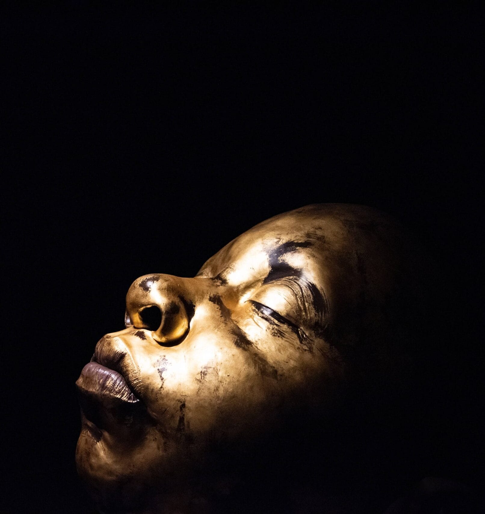
Materiality: Gold plays a central role—many of the museum’s most iconic archaeological pieces are made of gold, and it is explicitly referenced in the museum’s name.
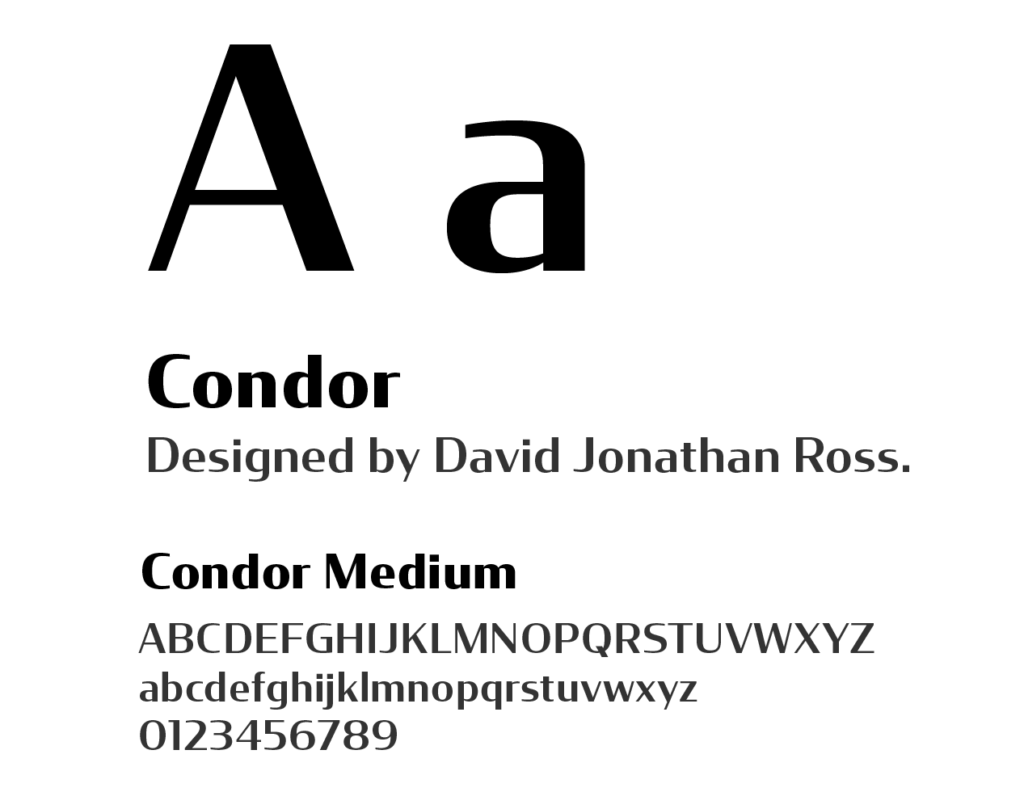
Using these principles, I explored logo concepts centered on the equilateral triangle and a gold-inspired color palette. The goal was to create a simple, recognizable symbol that reflects the interconnectedness of past, present, and future in Costa Rican history. I intentionally kept the mark minimal to ensure clarity and versatility, pairing it with Condor for the logotype. Serenity was selected as the supporting typeface to maintain visual consistency across all written materials.


Website Redesign
Designing for digital illuminates new possibilities through the confluence of human interaction and pixels. I took the liberty to curate the user’s experience rather than conforming to preconceived UX/UI norms.
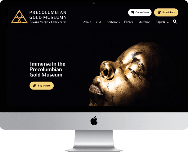
Homepage
The homepage was redesigned to improve clarity, navigation, and overall usability.
The header prioritizes quick access to the museum’s key services, with prominent entry points to the Online Store, Ticket Store, and Search. The navigation menu was simplified to surface the most important sections, reducing cognitive load and helping users orient themselves quickly.
The body of the page highlights each primary section from the navigation, giving users a brief preview of available content and allowing them to efficiently find what they need without unnecessary exploration.
The footer was fully reworked to support engagement beyond the visit. It now includes social media links, clear contact information, and additional pathways to connect with the museum, such as careers, facilities, and vendor resources.
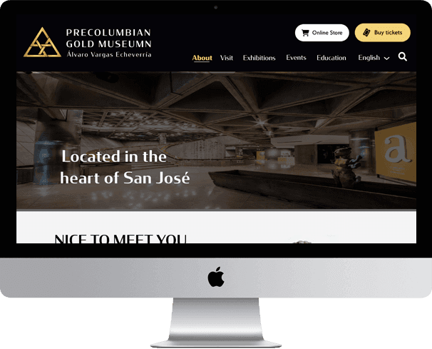
About
The About page was redesigned to clearly communicate the museum’s purpose, mission, vision, and history.
The previous version relied heavily on dense text and was difficult to navigate. To improve readability and engagement, I introduced a timeline, a hero banner, and an image gallery, allowing users to absorb key information visually and at their own pace.
To improve discoverability, the About page was added directly to the main navigation. Previously, it could only be accessed through the footer, making it easy for users to miss.
The updated header and footer were applied to this page as well, creating a more cohesive and elevated visual experience across the site.
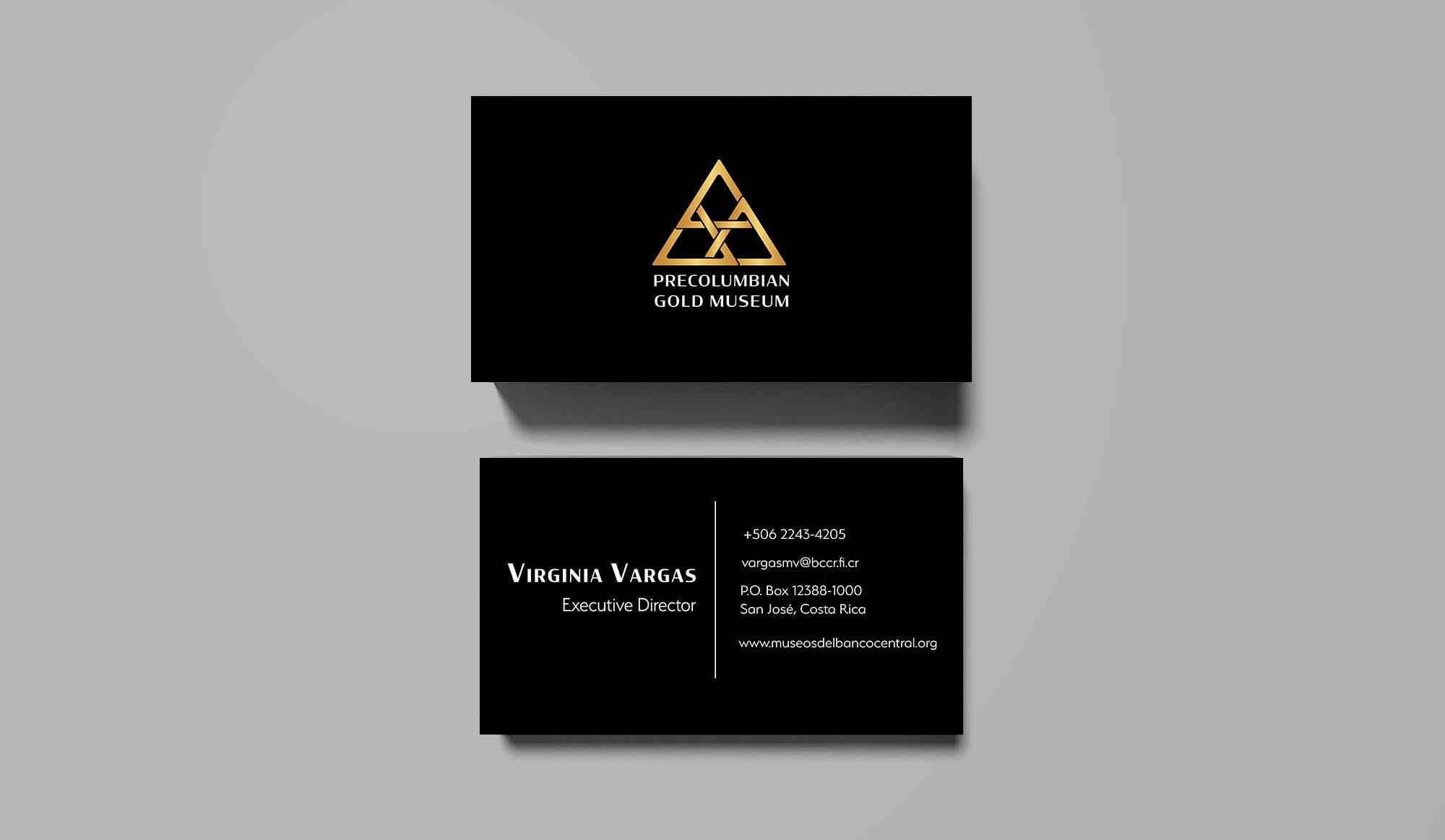
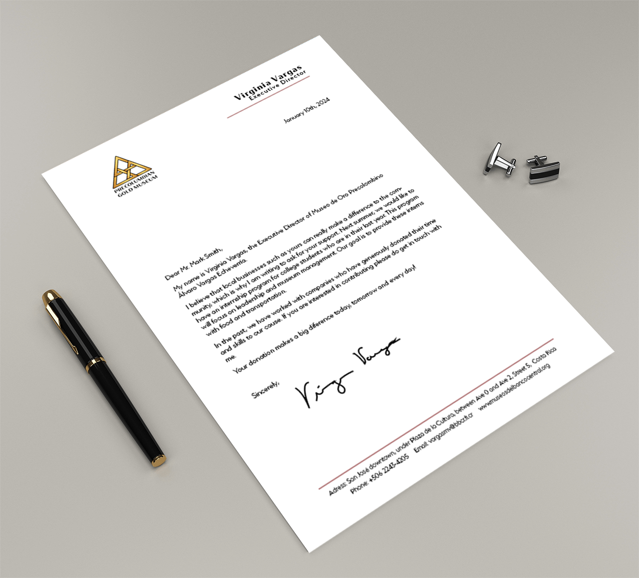
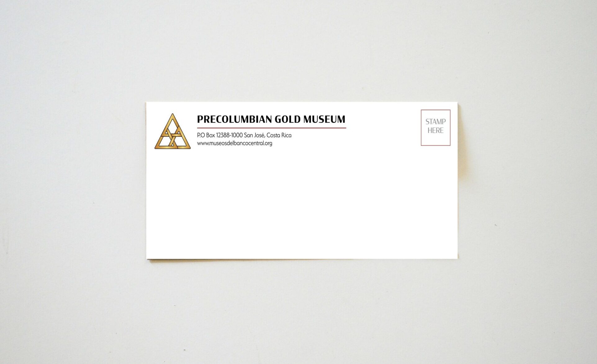
Business Stationary
Stationery has been an important part of social etiquette since the Victorian era. For this project, I designed a double-sided business card, letterhead, and envelope, ensuring each element contributed to a cohesive and unified visual identity.