Bancroft PFC
- Redesign Project
- Adobe Photoshop, Adobe Illustrator, WordPress
- Walnut Creek, CA
This portfolio piece details the website redesign project for the Bancroft Parent Faculty Club (PFC), a vital non-profit organization dedicated to supporting school-wide educational needs. The project’s goal was to transform their outdated digital presence into a modern, high-efficiency platform capable of supporting the sheer scale of their operations, maximizing community participation, and clearly reflecting their ambitious mission.
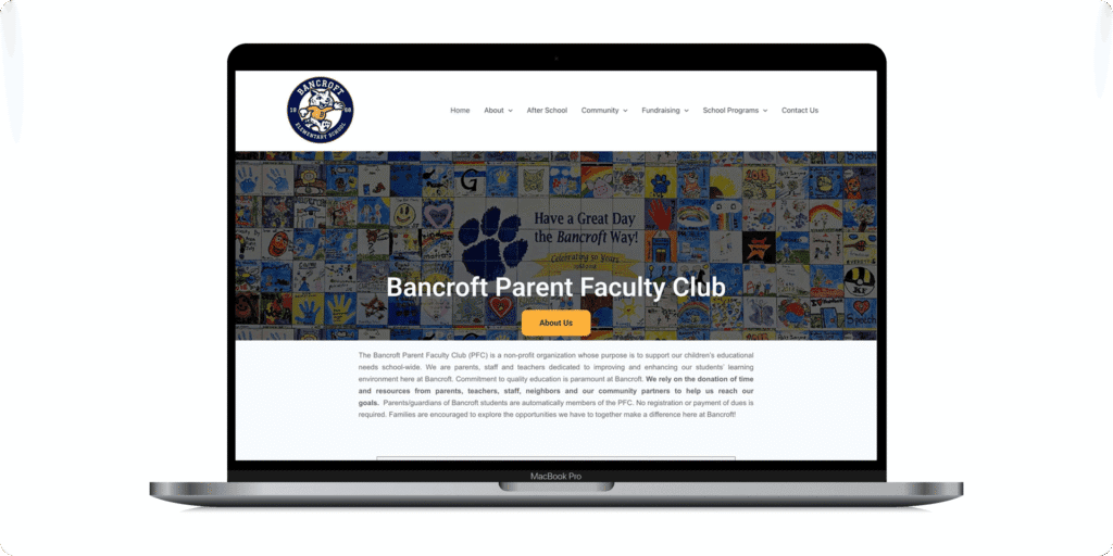
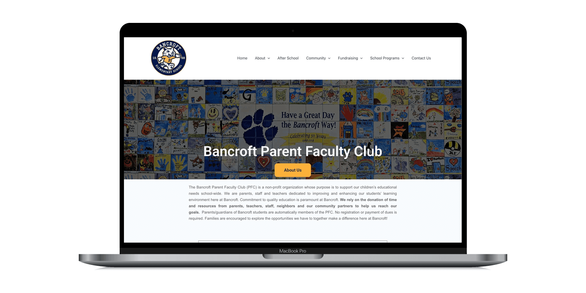
The Challenge
The mission of the PFC is clear: to inspire students to love learning and foster a supportive community. This redesign aimed to transform their outdated digital presence into a modern, effective platform that could support the scale of their operations, streamline communications, and truly reflect their ambitious mission.
Despite serving a large community and managing a substantial annual budget, the Bancroft PFC relied on a visually inconsistent and structurally limited website. The outdated platform failed to align with the PFC’s mission, making it difficult to track fundraising progress, efficiently coordinate volunteer opportunities, or clearly communicate the impact of their financial initiatives. Essentially, the website was a bottleneck that could not support the financial and administrative scale of the organization, frustrating the board and dampening parent participation.
To ground the redesign in real-world needs, a primary UX persona was developed: “Ria, the Maximizing Mother.” Ria is an involved parent with two children in elementary school who actively seeks to support the school while balancing her family and professional life. She demands efficiency from the site so she can complete her tasks quickly and return to her responsibilities.

Ria, "the Maximizing Mother"
36 • Married • Strategy Consultant • Walnut Creek, CA
“I want clear, up-to-date information regarding how the PFC’s funds are utilized, school social events, and the impact of my volunteer time.”


Designing the Brand
To establish immediate brand recognition and build trust, the color palette was built upon the school’s core colors: Blue and Yellow. A modern, clean aesthetic was applied, and ample white space was prioritized to reduce visual clutter, ensuring the site felt light and easy to scan.
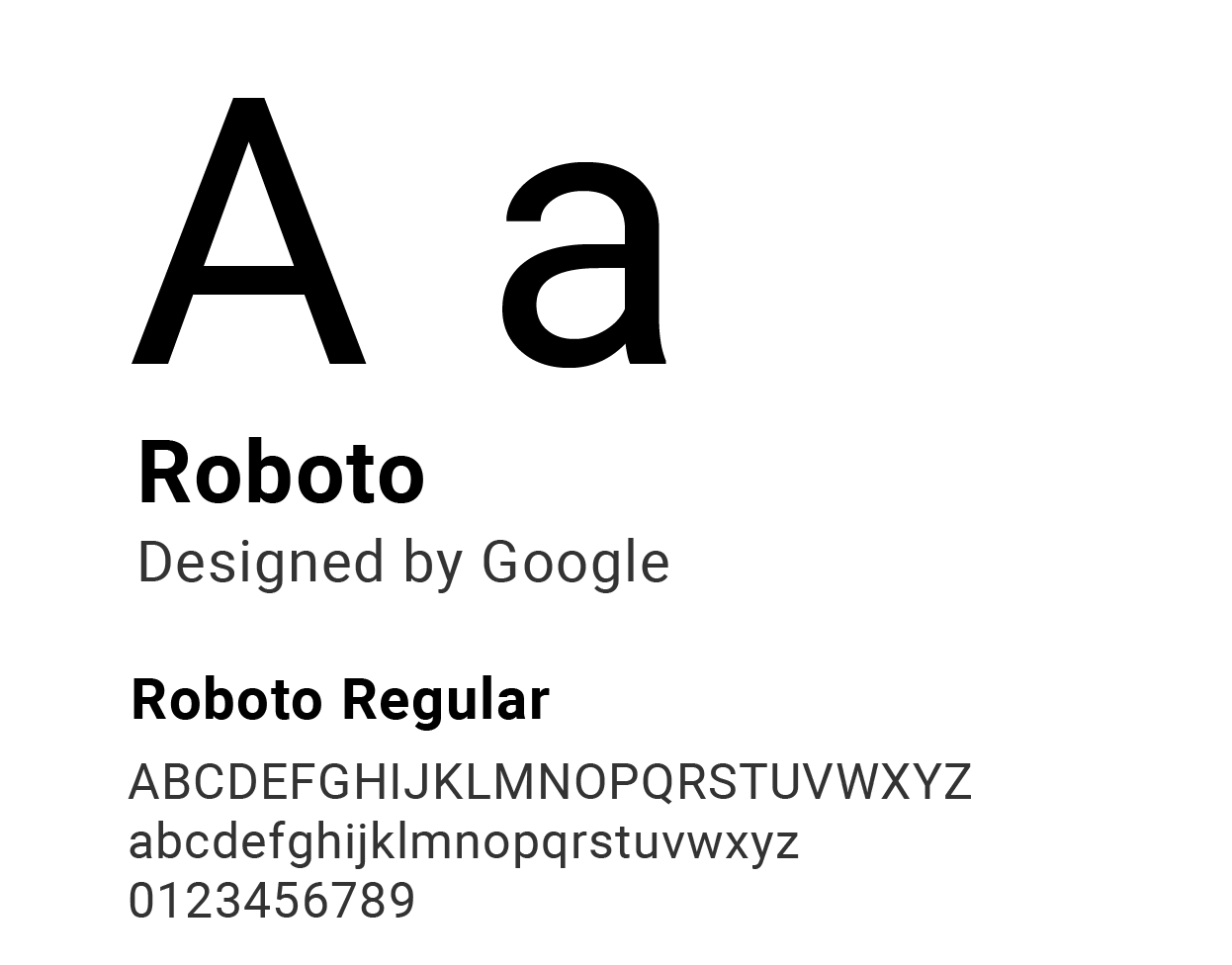
Roboto was chosen as the typography for its universal legibility and neutrality. This standard, accessible sans-serif ensures all critical content—especially meeting dates and forms—is immediately accessible on mobile devices, ensuring the focus remains squarely on the content and information, not on the typography.
The project also included a proposed refresh of the school mascot, the Bobcat. The previous version was outdated and lacked versatility. A modernized Bobcat design was created, maintaining the school’s heritage while offering a cleaner, more approachable graphic that could be used effectively across the website, digital communications, and merchandise.

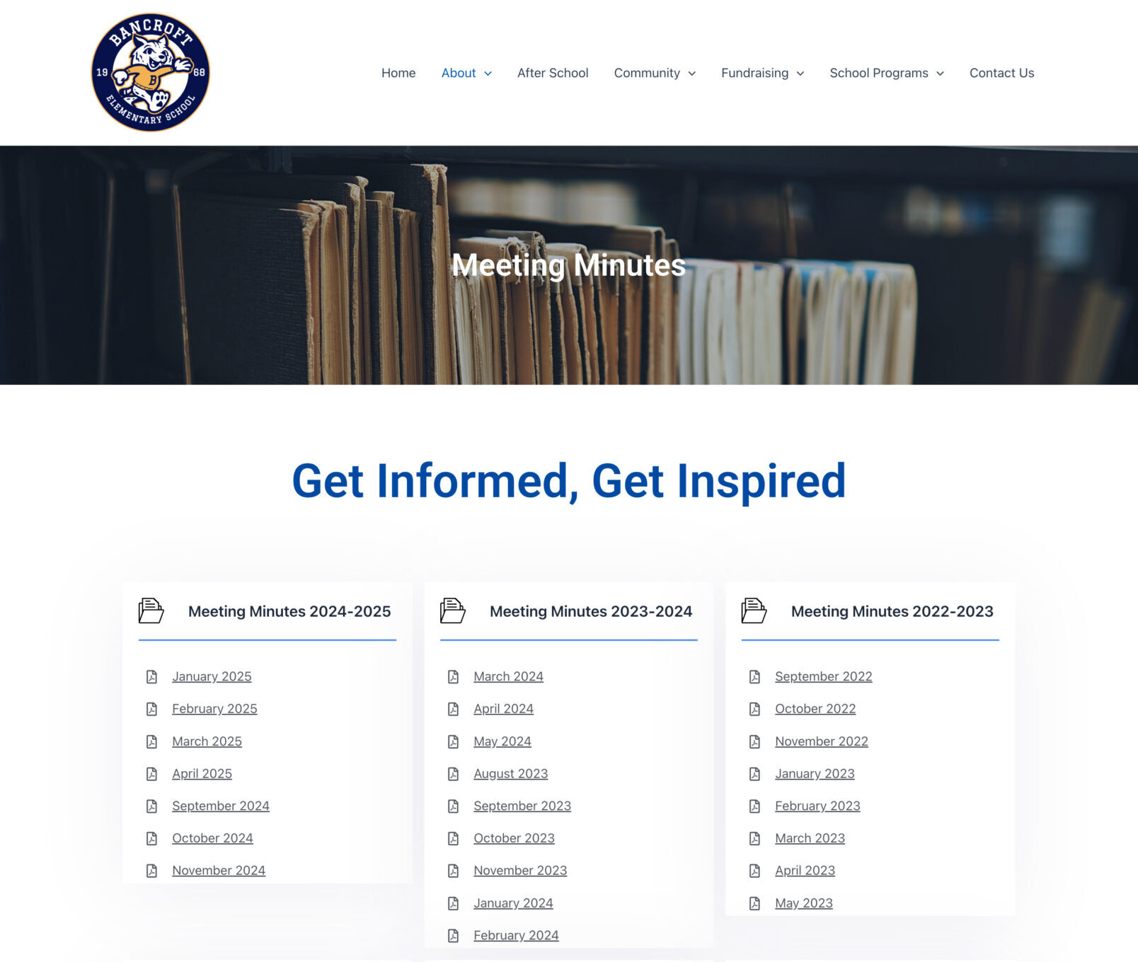

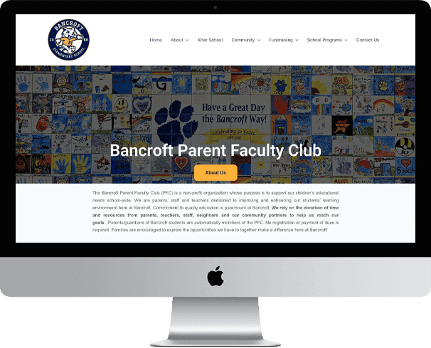
Website Redesign
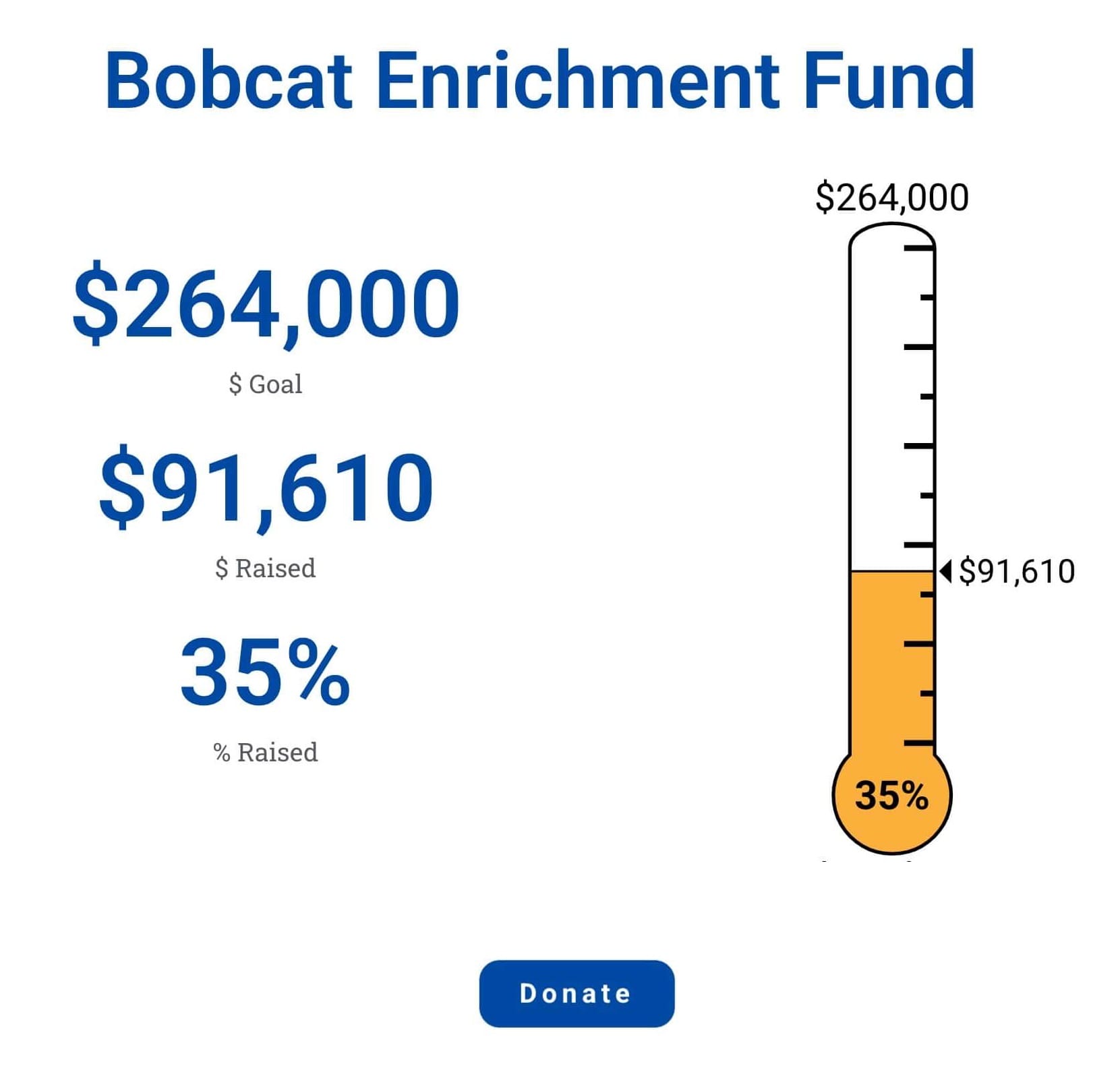
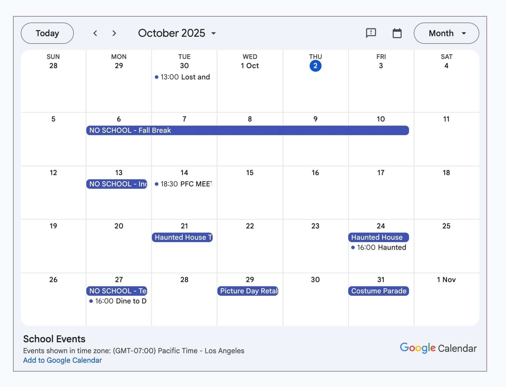
The redesign of the Bancroft PFC website focused on transforming it from a confusing, archival-style site into a streamlined, action-oriented digital hub for the school community. The strategy was shaped around the needs of the UX Persona—a busy parent seeking quick, efficient access to key information. The information architecture was completely overhauled, with fragmented navigation replaced by a simplified structure that enabled primary tasks to be completed in two clicks or less. Core functionality was then prioritized through strategic placement of key features above the fold and in persistent navigation: a filterable calendar for all school and PFC events, embedded quick-access forms, and a prominent donation button to support the organization’s annual fundraising goals.
Project Impact
The redesigned website immediately transformed the Bancroft PFC’s operational efficiency and community engagement. The PFC board reported being highly satisfied with the final product, which provided the modern, authoritative platform the organization required. By prioritizing transparency and intuitive navigation, the site successfully reduced the administrative bottleneck: the board observed a noticeable decrease in repetitive questions from both new and former parents regarding key dates and logistics. Furthermore, the clear, up-to-date information and improved clarity around financial goals led to improved fundraising efforts—parents now easily understand how much is fundraised and precisely where those funds are spent, fostering deeper trust and maximizing engagement across the entire school community.