Travel Smart
- UX Research & UI Project
- Adobe XD, Adobe Photoshop, Miro, iMovie
- South Korea & San Francisco, CA
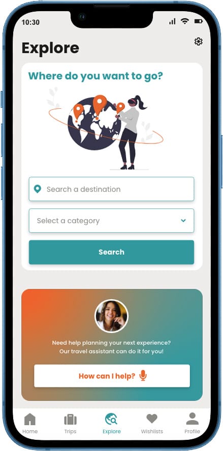
This project was delivered by a cross-regional team of three UX designers based in South Korea and the San Francisco Bay Area. We divided ownership by service area (Wallet, Trips, and Explore), and I owned the Explore experience end-to-end—from problem definition through delivery.


Before

“I have so many confirmation emails. I can’t remember at which sites I booked reservations.”
During
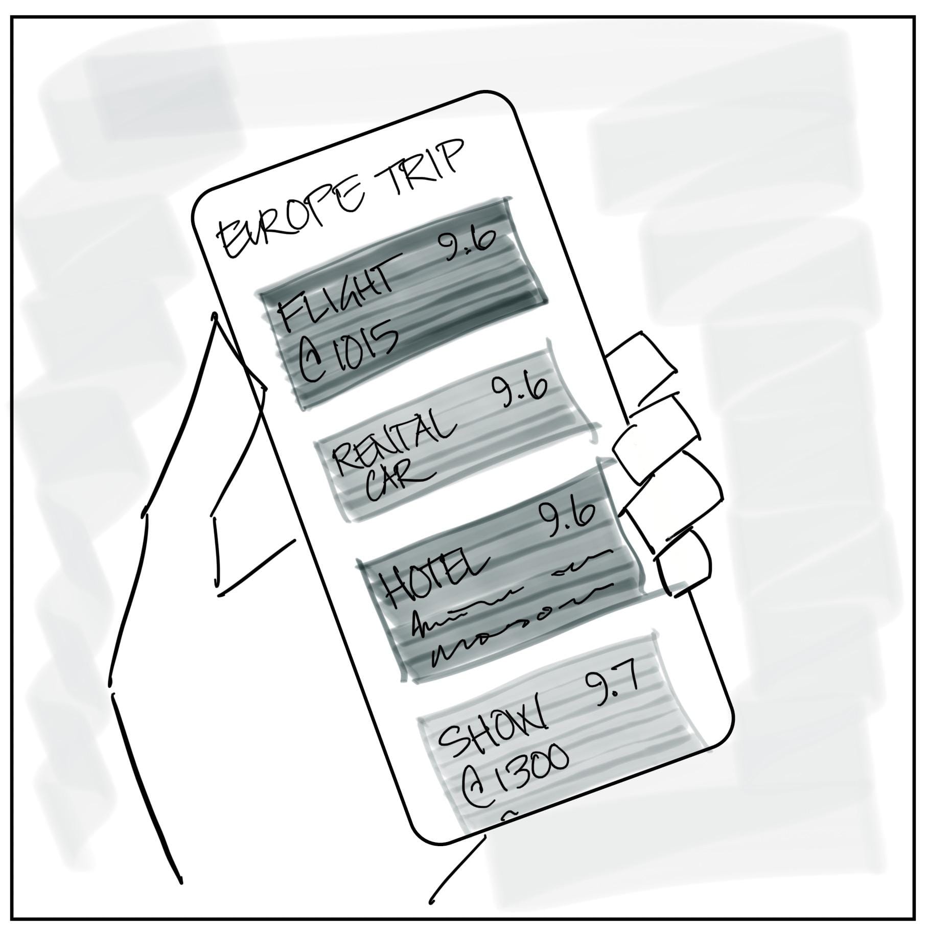
“My friend has the Travel Smart app to organize all of our information and keep track of our plans.”
After
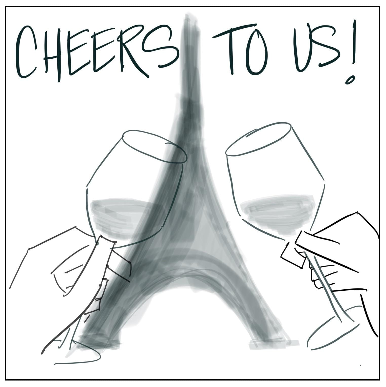
“All of our essential trip details are organized in one place. We can relax & enjoy ourselves!“
Before

“I have so many confirmation emails. I can’t remember at which sites I booked reservations.”
During

“My friend has the Travel Smart app to organize all of our information and keep track of our plans.”
After

“All of our essential trip details are organized in one place. We can relax & enjoy ourselves!“
Background
Travelers need a simple way to manage their trips because trip planning and execution often require juggling information across multiple sources, leading to overwhelm, disorganized itineraries, and frustration when accessing essential details while traveling.
Travel Smart was designed for two primary user segments: individual travelers (e.g., business professionals) and group travelers (e.g., families). These segments were represented by the personas Charlie and James, which helped guide prioritization and design decisions throughout the project.

Charlie
"The Busy Traveler"
28 • Single • Marketing Specialist • Denver, CO
“Because my job is demanding, I’d like to find enjoyable activities while traveling for work.”

James
"The Organized Dad"
44 • Married • Operations Manager • Reston, VA
“Family trips are so fun but also expensive. I want to make sure we make the most of our time.”
Trips
Explore

Wallet

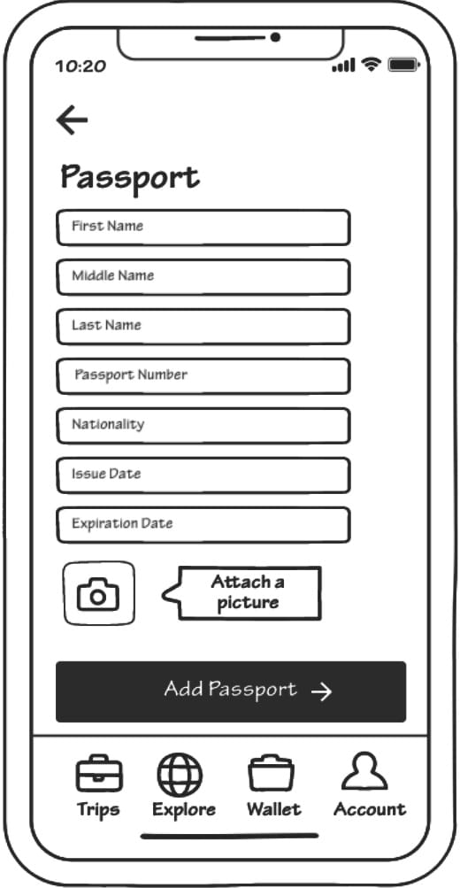
Trips


Explore


Wallet


After testing our ideation concepts, we developed task flows to address users’ critical problems and map key touchpoints and future screens. Based on insights from testing, we made a strategic change: Wallet was split into two distinct services (Tickets and Reservations & Passes) to reduce confusion and better align with user needs.
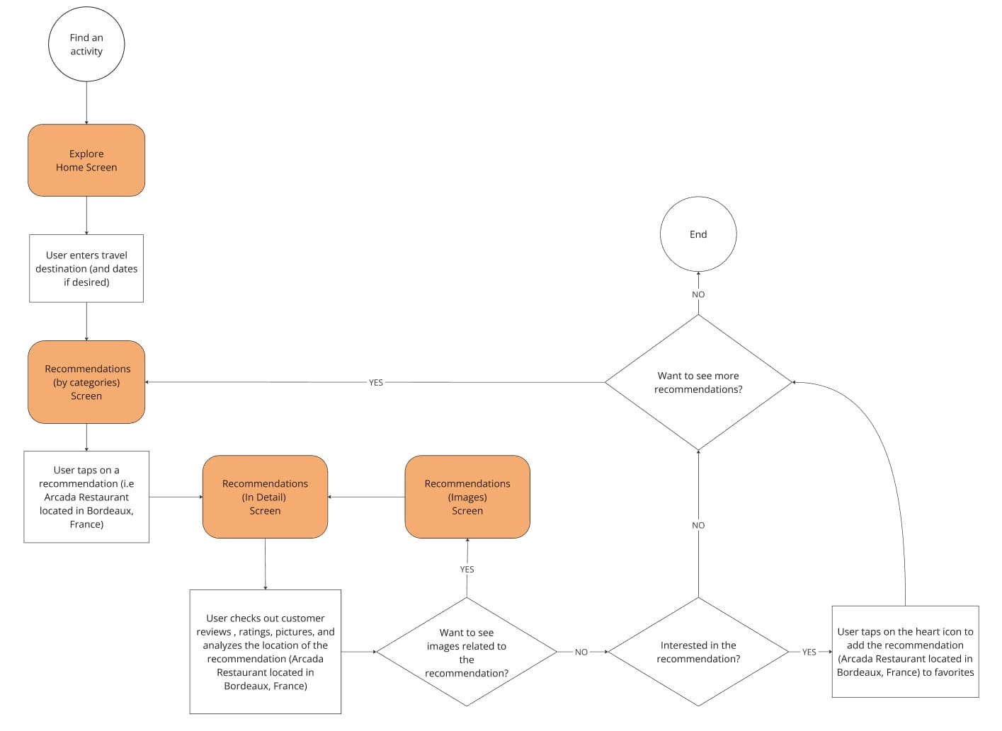
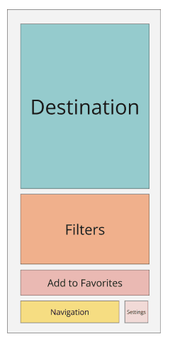
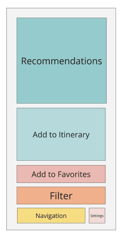
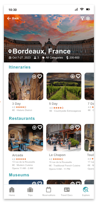
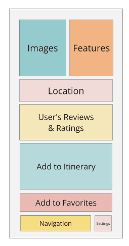
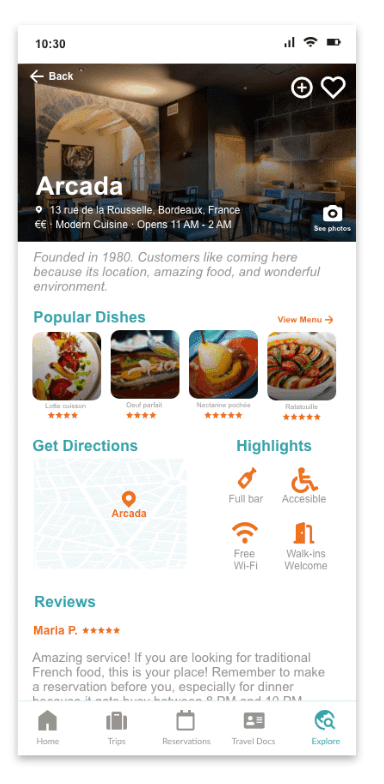
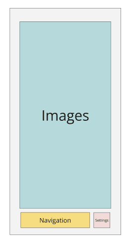
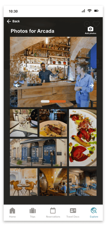
Below there is an example of a task flow for Explore (Get a Recommendation). From this task flow, 4 screens were identified: Explore Home Screen, Recommendations (by categories), Recommendations (in detail), and Recommendations (images). Each screen was first translated into a block wireframe, which was then refined into a medium-fidelity wireframe to visualize layout and interactions.




Design Process
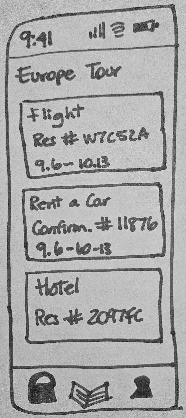
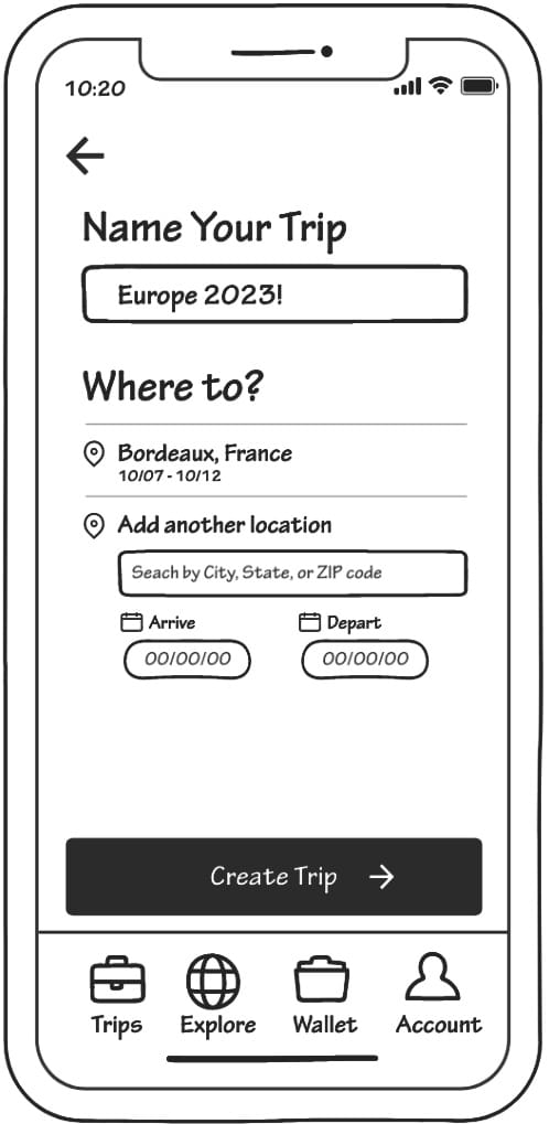
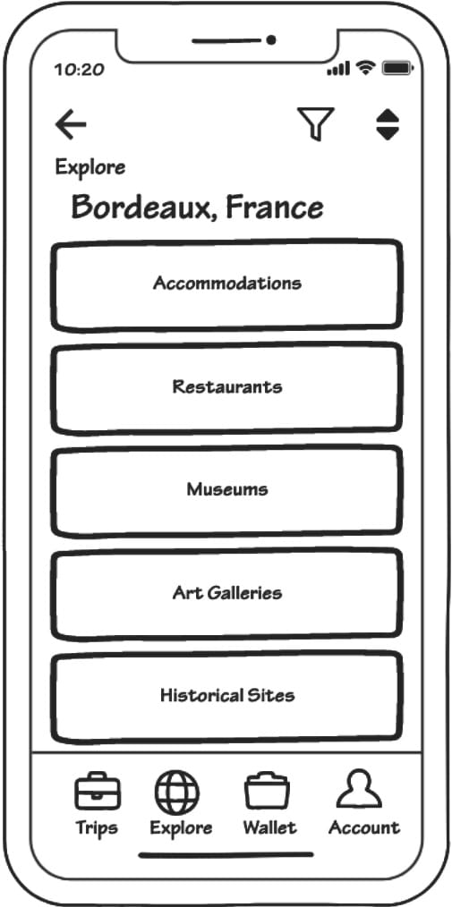
We started our design process with a brainstorming session where 3 main services were defined: Trips (to manage trips and itineraries), Wallet (for travel documents), and Explore (to get travel recommendations). From there, we created low-fidelity sketches for each service, which evolved into ideation concepts. These concepts were then tested with target users to validate solutions against our problem statement.
For Trips, users responded positively to the design concept, expressing interest in viewing past and upcoming trips and seeking guidance with itinerary creation. For Explore, users were enthusiastic and wanted personalized recommendations tailored to their preferences. For Wallet, users valued security and a friendly interface, but were unsure what content should be stored there, highlighting an area for further clarification and design iteration.



Research & Final Wireframes
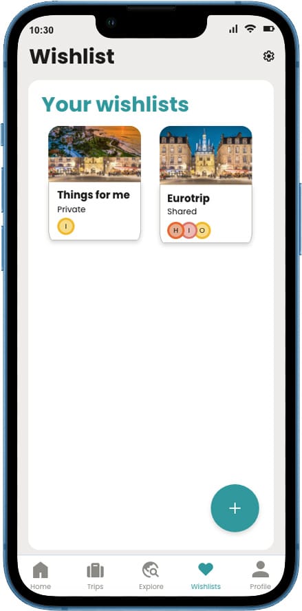
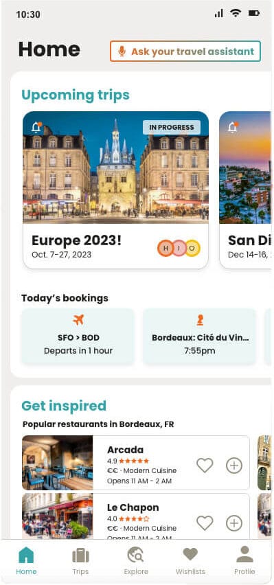
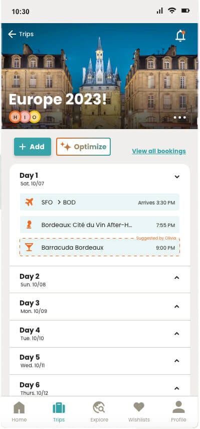
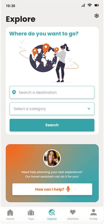
Following usability testing, we refined the medium-fidelity wireframes based on user feedback. Key updates included confirmation screens for actions (add, modify, delete), cosmetic improvements (headers, highlighted itinerary items, button repositioning), and enhanced filters for Explore.
Three major changes were made to the navigation menu to improve clarity and usability:
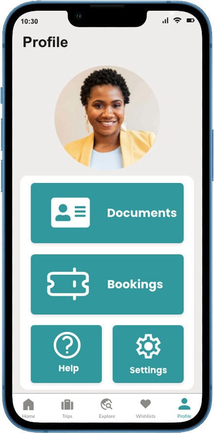
Profile & Travel Documents: Users were confused about the purpose of Reservations and Travel Documents. We created a Profile section and moved Travel Documents inside.
Reservations: Removed from the main navigation and integrated directly into the itinerary screen.
Wishlist: Favorites was removed from Explore Home, added to the navigation menu, and renamed Wishlist for clearer intent.
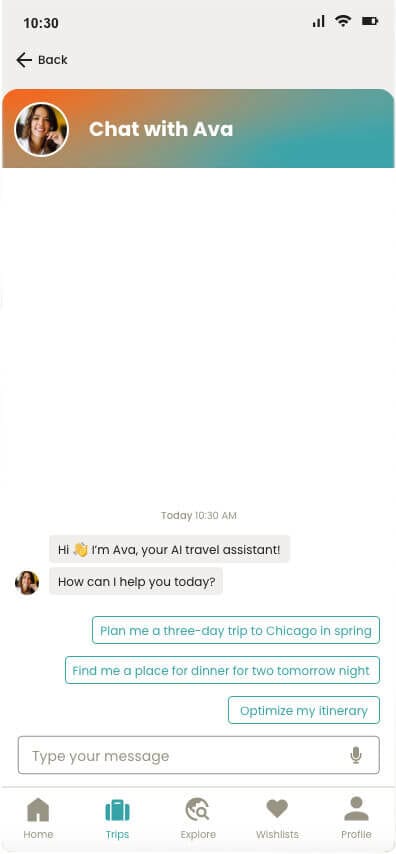
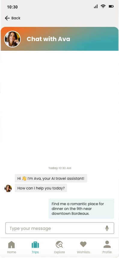
Finally, Ava, the Intelligent Travel Assistant, was integrated across Smart Travel to enhance functionality and user experience. Ava helps users optimize itineraries, discover recommendations, manage documents, reservations, and wishlist items, and answers travel-related questions.
Style Guide
Primary Colors
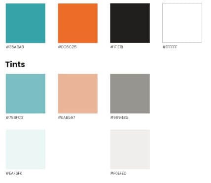
Secondary Colors

Primary Colors

Secondary Colors

Design System
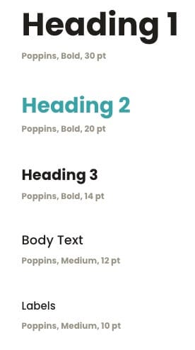
Typography
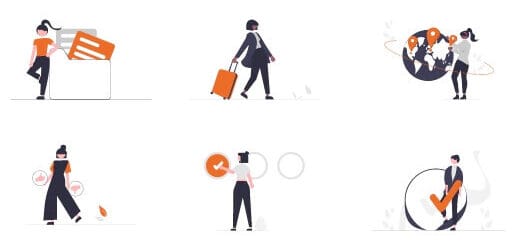
Illustrations
Typography

Illustrations

Atoms
Icons
Icons
Molecules
Navigation

Trips Card Tags

Navigation

Trips Card Tags

Drop-Down Lists

Trips Itinerary Single Entry

Drop-Down Lists

Trips Itinerary Single Entry

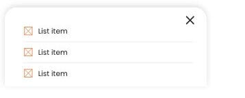
Pop-up List from Bottom Bar
Trips Itinerary Item Added Confirmation
Pop-up List from Bottom Bar

Trips Itinerary Item Added Confirmation
Pop-up List from Bottom Bar

Form Fields

Pop-up List from Bottom Bar

Form Fields

Buttons

Buttons

Organisms
Status Bar

Status Bar

Navigation

Navigation

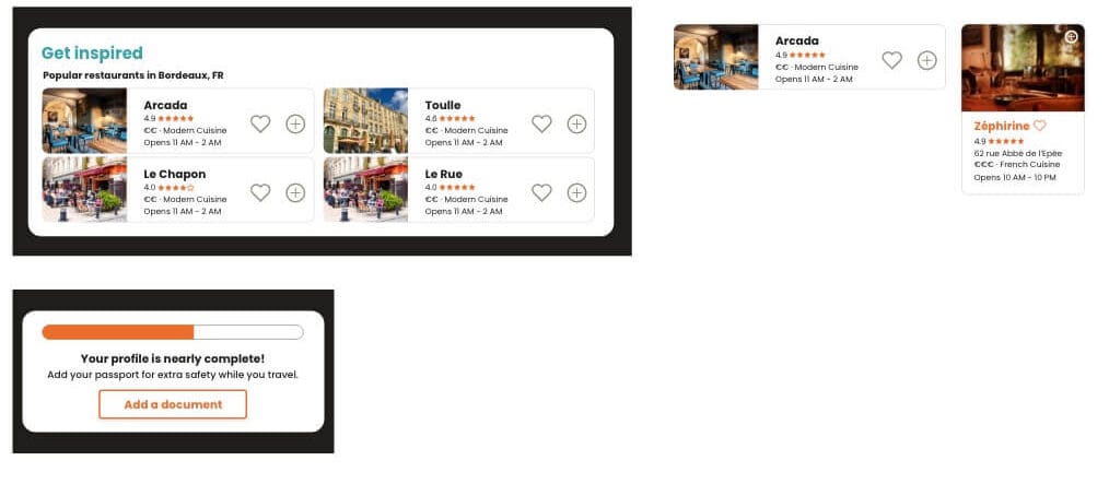
Home
Home

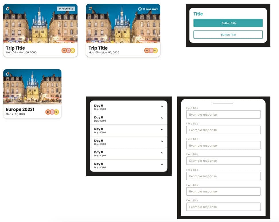
Trips
Trips

Working on this project was a stimulating challenge for our team, especially given the 17-hour time difference between South Korea and the USA and a fully remote collaboration setup. To ensure alignment and efficiency, we implemented a design system that established the brand’s visual language and ensured consistency across all screens and interactions.
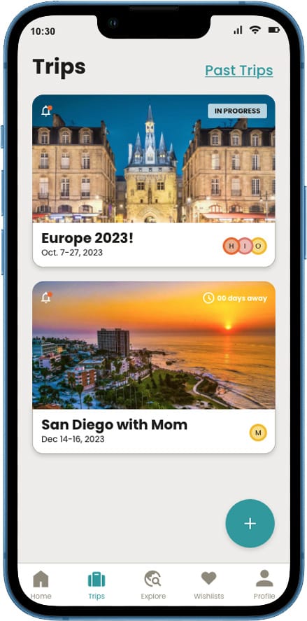
Travel Smart was designed to provide easy access to travel-related data in one place.

Travel Smart was designed to provide easy access to travel-related data in one place.
Prototype
The prototype was designed using Adobe XD. It showcases an intuitive and user-friendly interface, providing a seamless experience for users navigating through the app. With interactive elements, smooth transitions, and real-time feedback, the prototype effectively demonstrates Travel Smart’s core features.


