Sanus
- HTML/CSS/JS/JQuery
- Adobe Photoshop, Adobe XD, Visual Studio Code, GitHub
- San Francisco, CA
This capstone project showcases the development of a fully responsive website built with HTML, CSS, JavaScript, and jQuery, emphasizing rapid prototyping and user-focused design. The project was managed end-to-end, with the complete codebase maintained in a structured GitHub repository to support transparency and iteration. The live product was deployed via GitHub Pages, allowing stakeholders to easily access, evaluate, and interact with the solution.
The Project
This project followed a six-step product development workflow—from topic definition and content strategy to wireframing, high-fidelity design, prototyping, front-end development, and GitHub deployment. This approach integrated design thinking, usability validation, and iterative development to deliver a cohesive, user-centered web product.
Website Structure
The website is composed of six interconnected pages, each designed to meet specific functional and user experience goals.
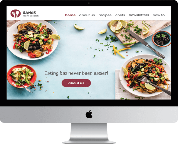
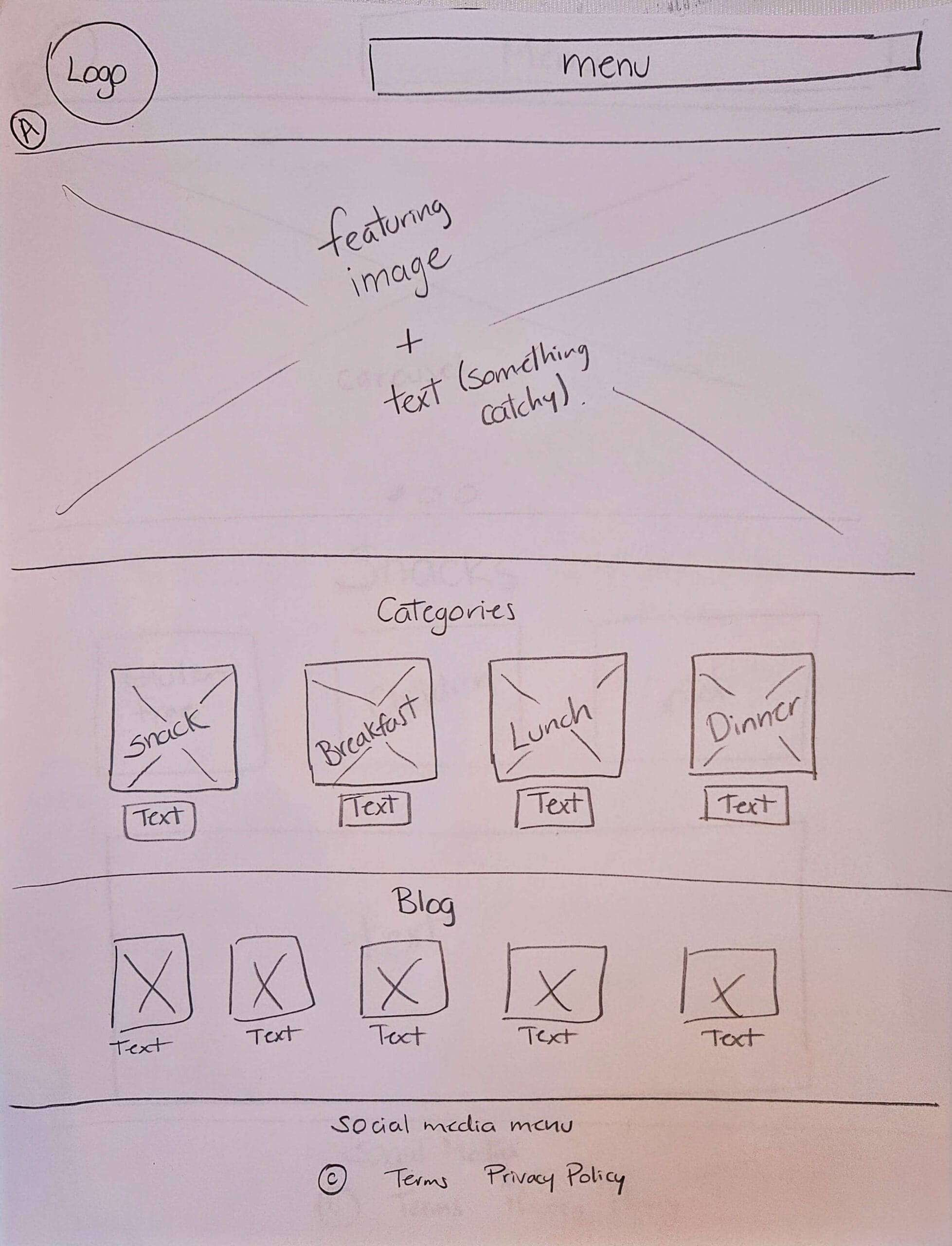
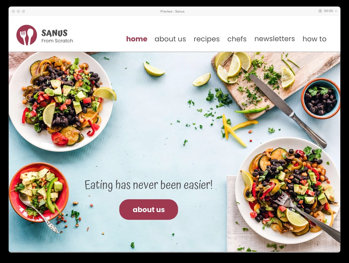
The Home page creates immediate visual impact with a full-screen background image.
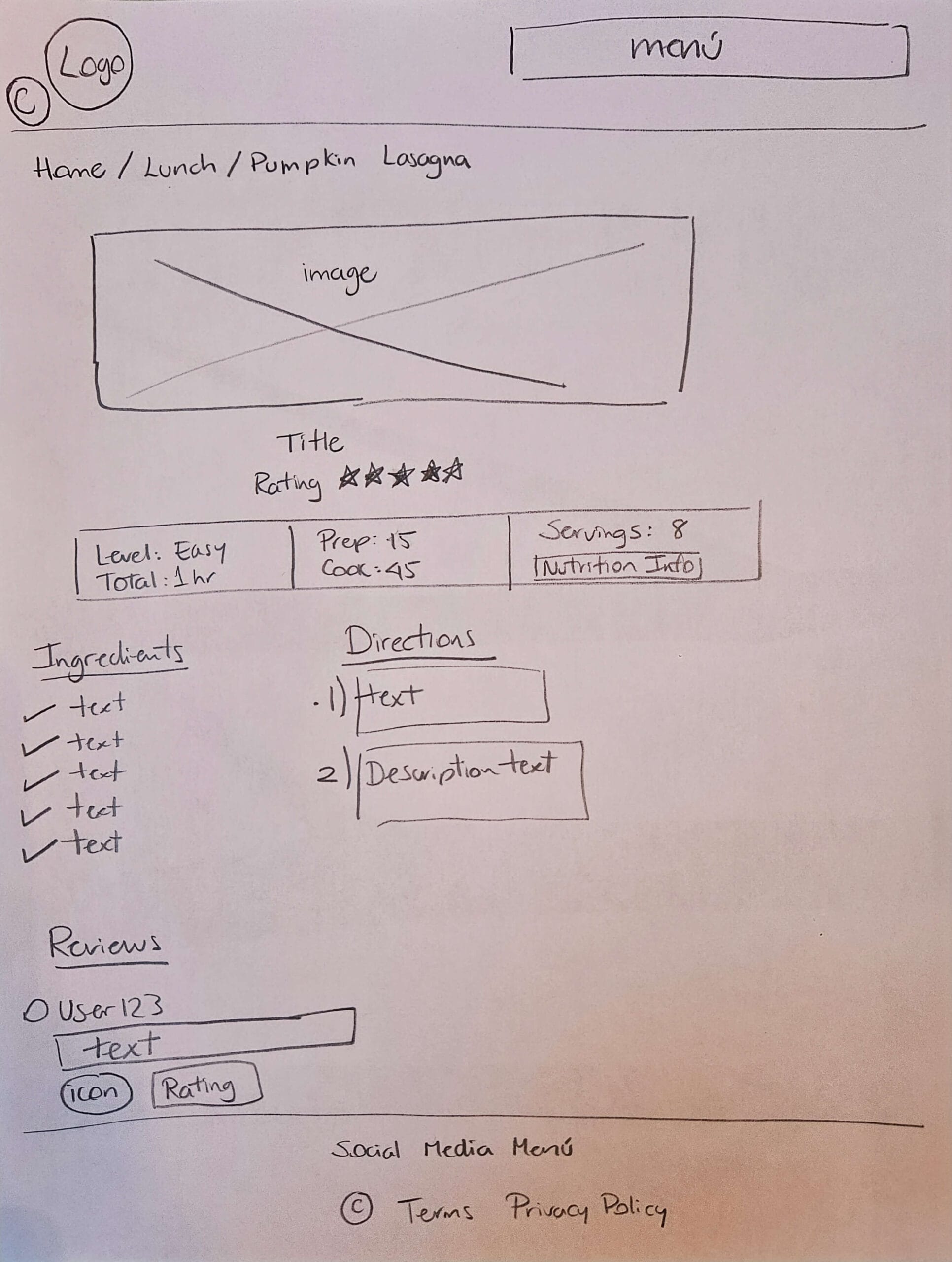
The Second page presents content-rich sections with two large text blocks, supporting imagery, and structured lists for improved readability.
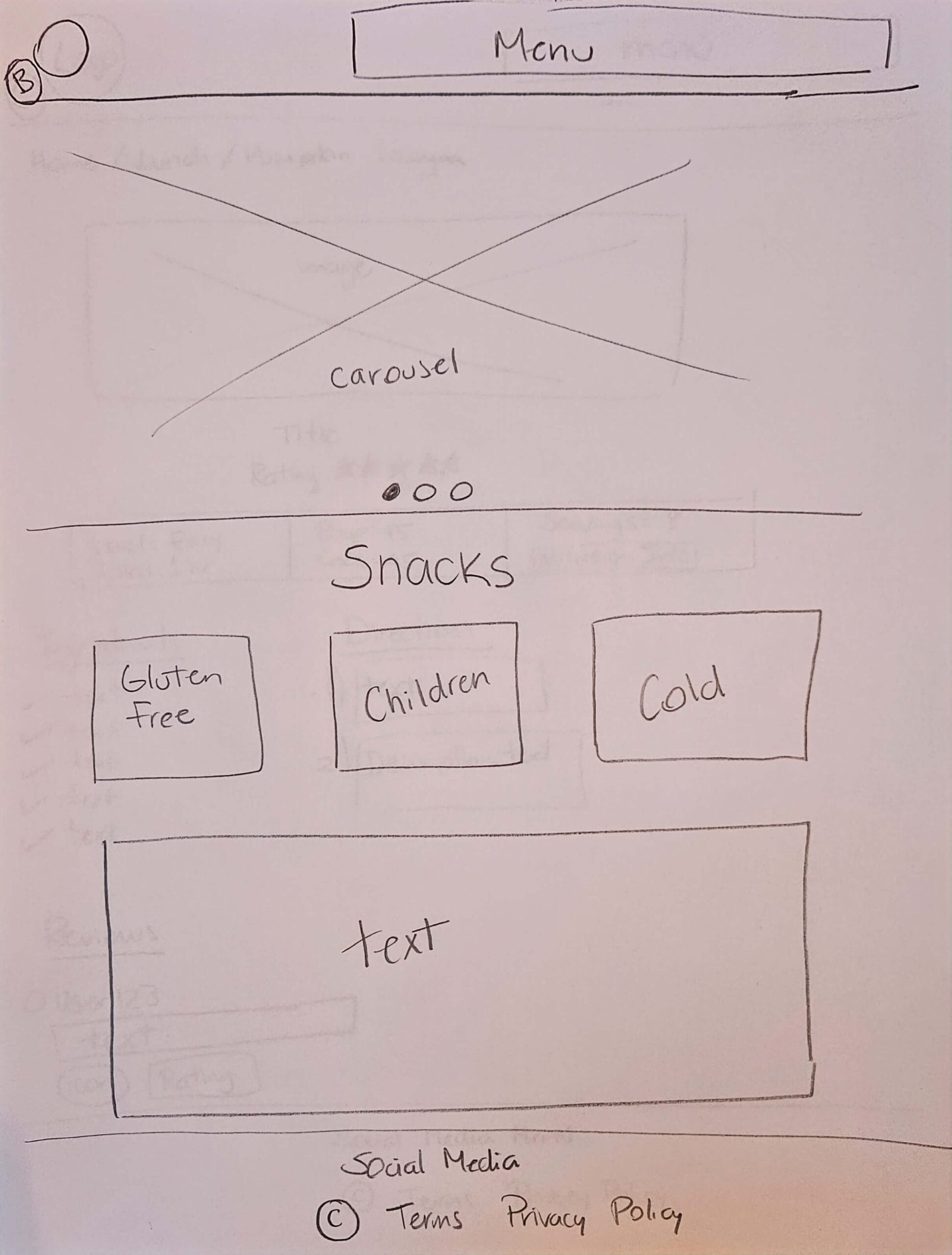
The Third page introduces interactive elements, including a three-slide carousel and a scrollable text area, to deliver information dynamically.
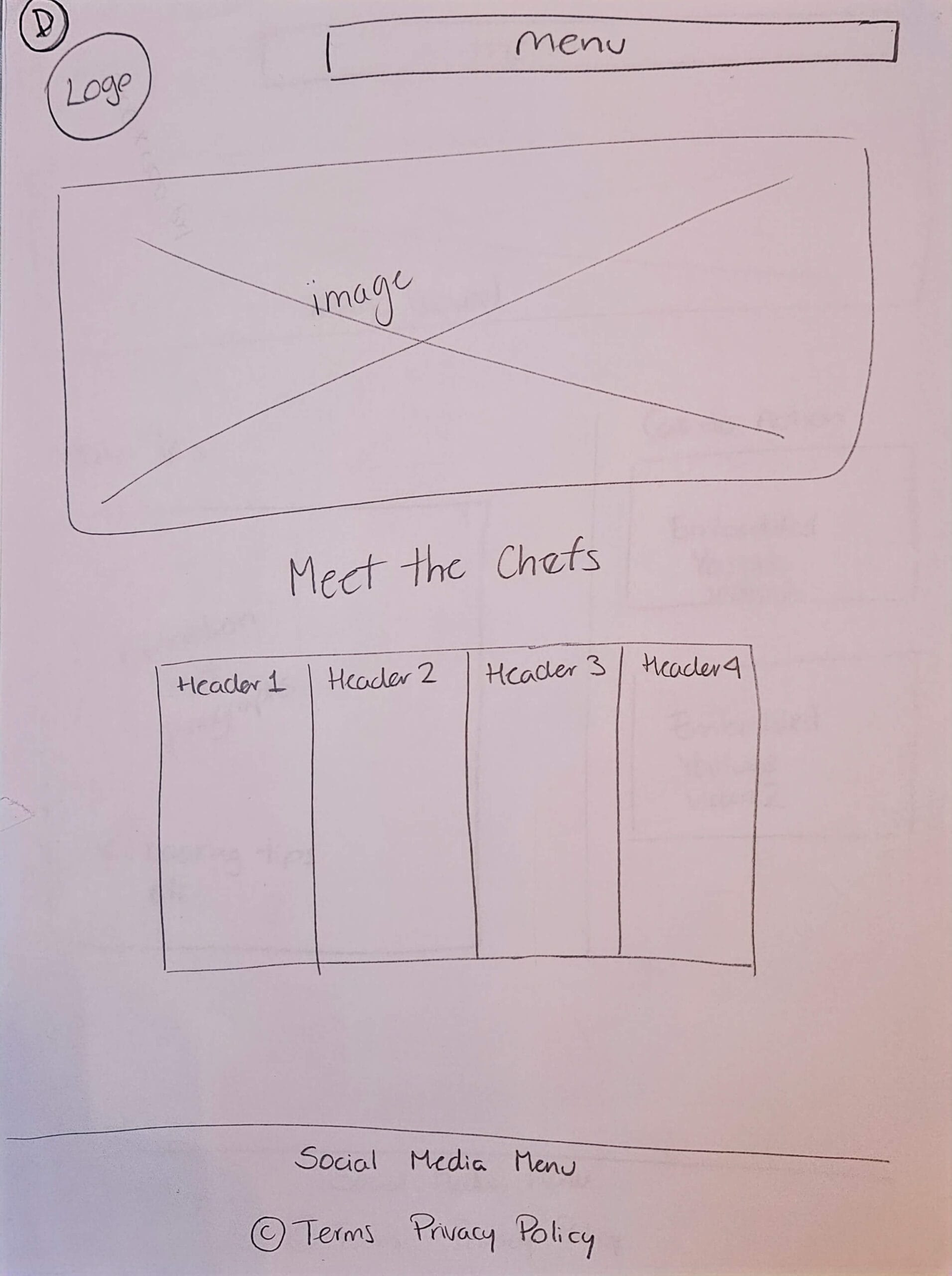
The Fourth page focuses on data organization, featuring a sortable table with four columns and ten entries for easy comparison.
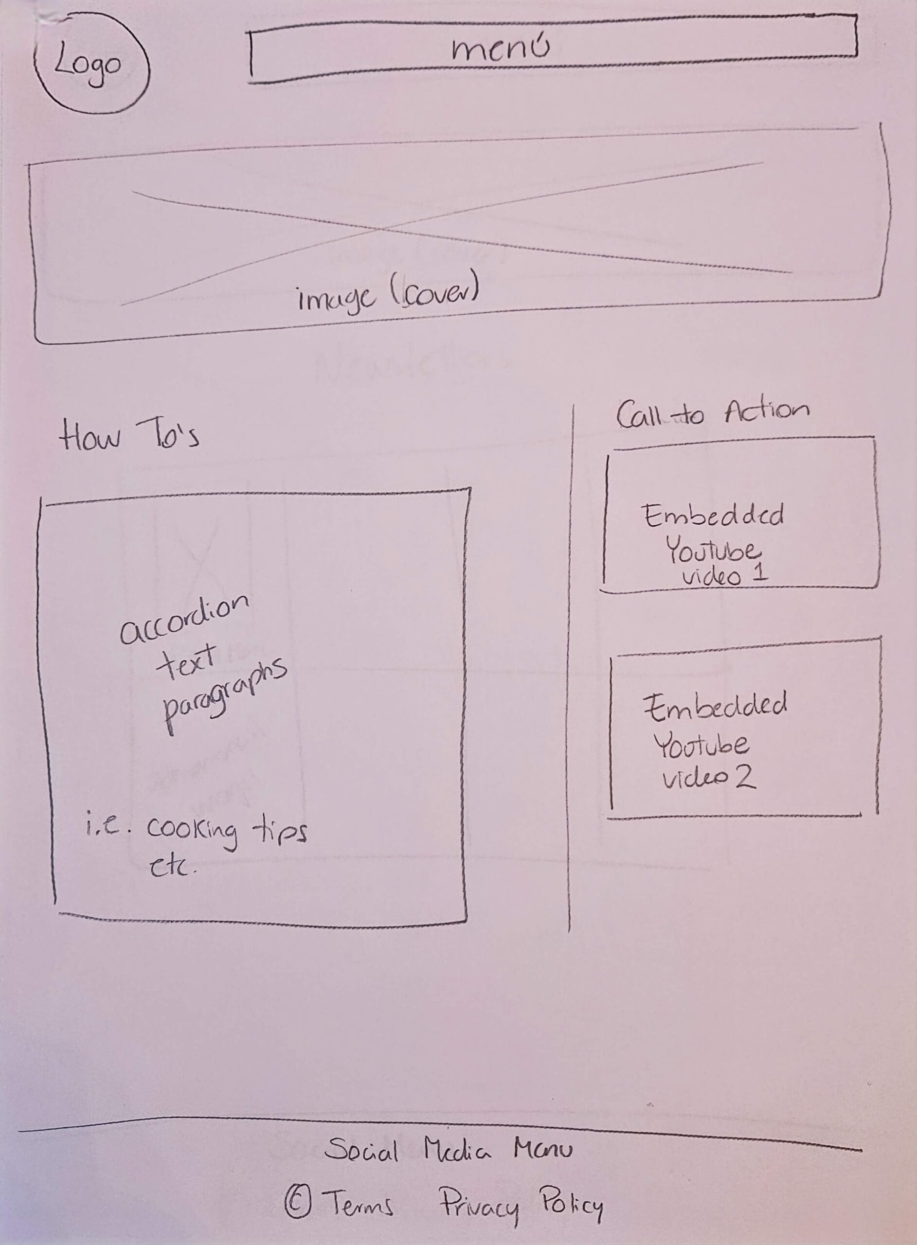
The Fifth page integrates multimedia with three embedded YouTube videos, accompanied by accordion-style text for progressive disclosure.
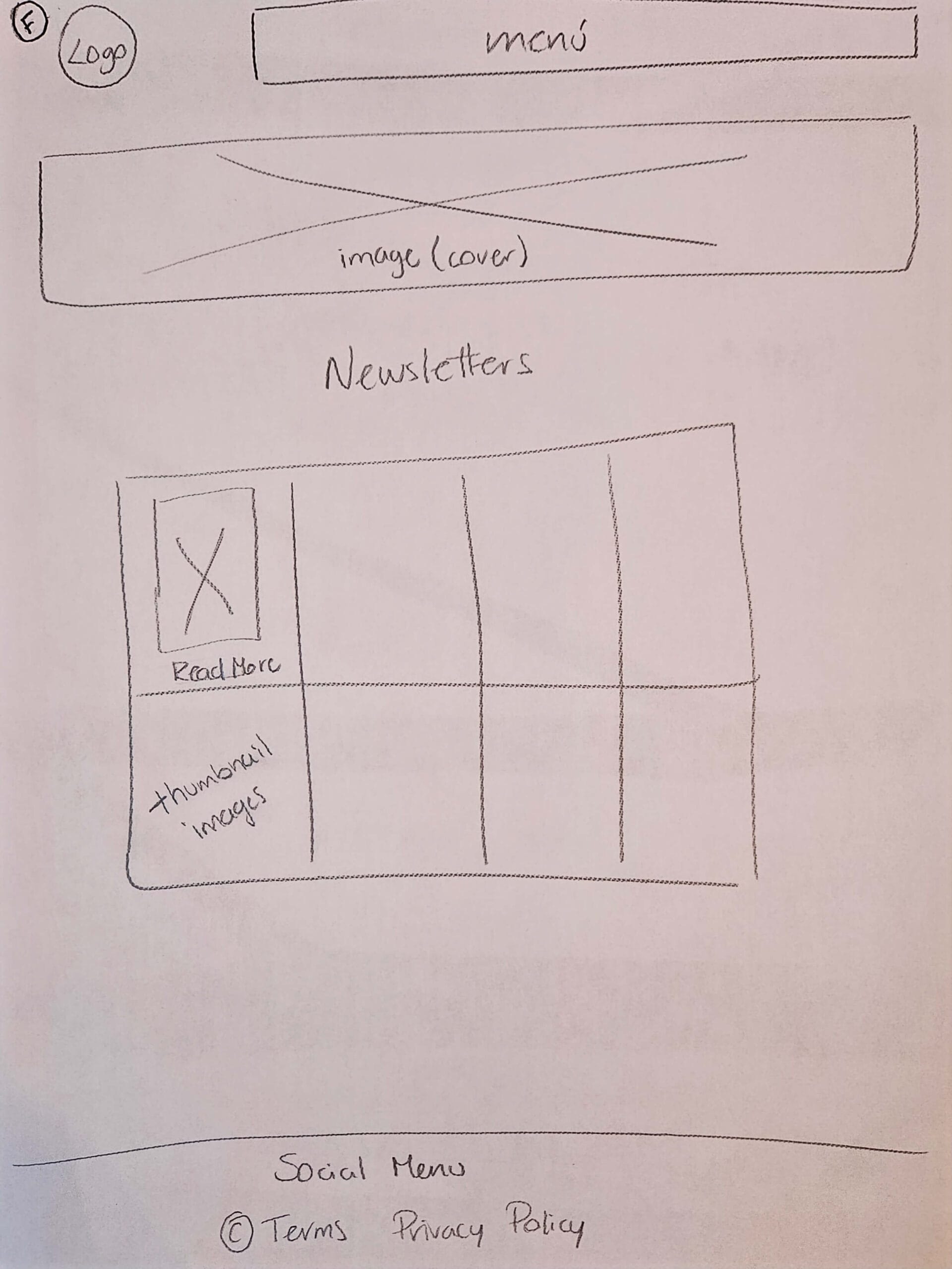
The Final page showcases an image gallery of eight thumbnails with a lightbox effect, allowing users to explore visuals without leaving the page.
All pages maintain consistent core elements to support usability and brand cohesion. This includes a logo for visual identity, a global navigation menu for seamless movement across the site, and a persistent footer containing social media links, contact information, and copyright details—ensuring accessibility, credibility, and a cohesive user experience throughout.
The Process
1. Topic Selection & Content Definition
For topic selection, the project focused on creating a healthy food website designed to help users discover recipes, learn about their favorite chefs, and access practical cooking tips. The choice was driven by both a personal passion for healthy eating and a recognition of a user need: people often struggle to find trustworthy, organized, and engaging content in one place. This topic allowed for the exploration of content strategy, user flows, and interactive features, demonstrating an approach grounded in understanding user goals and designing solutions that deliver value efficiently.
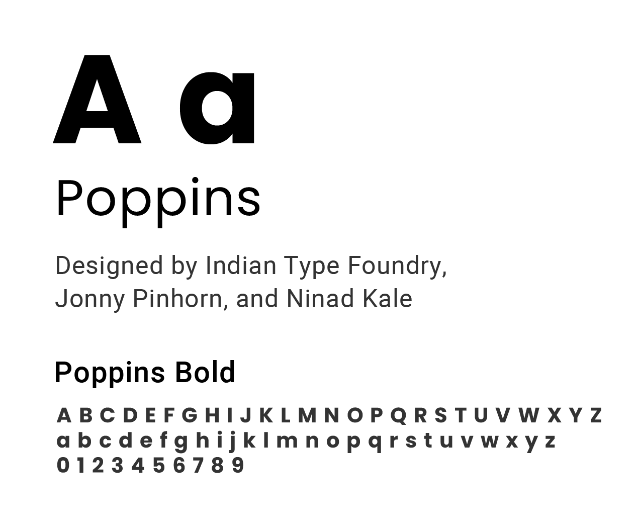
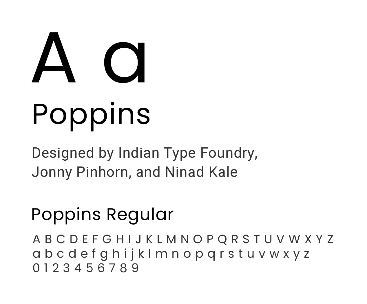
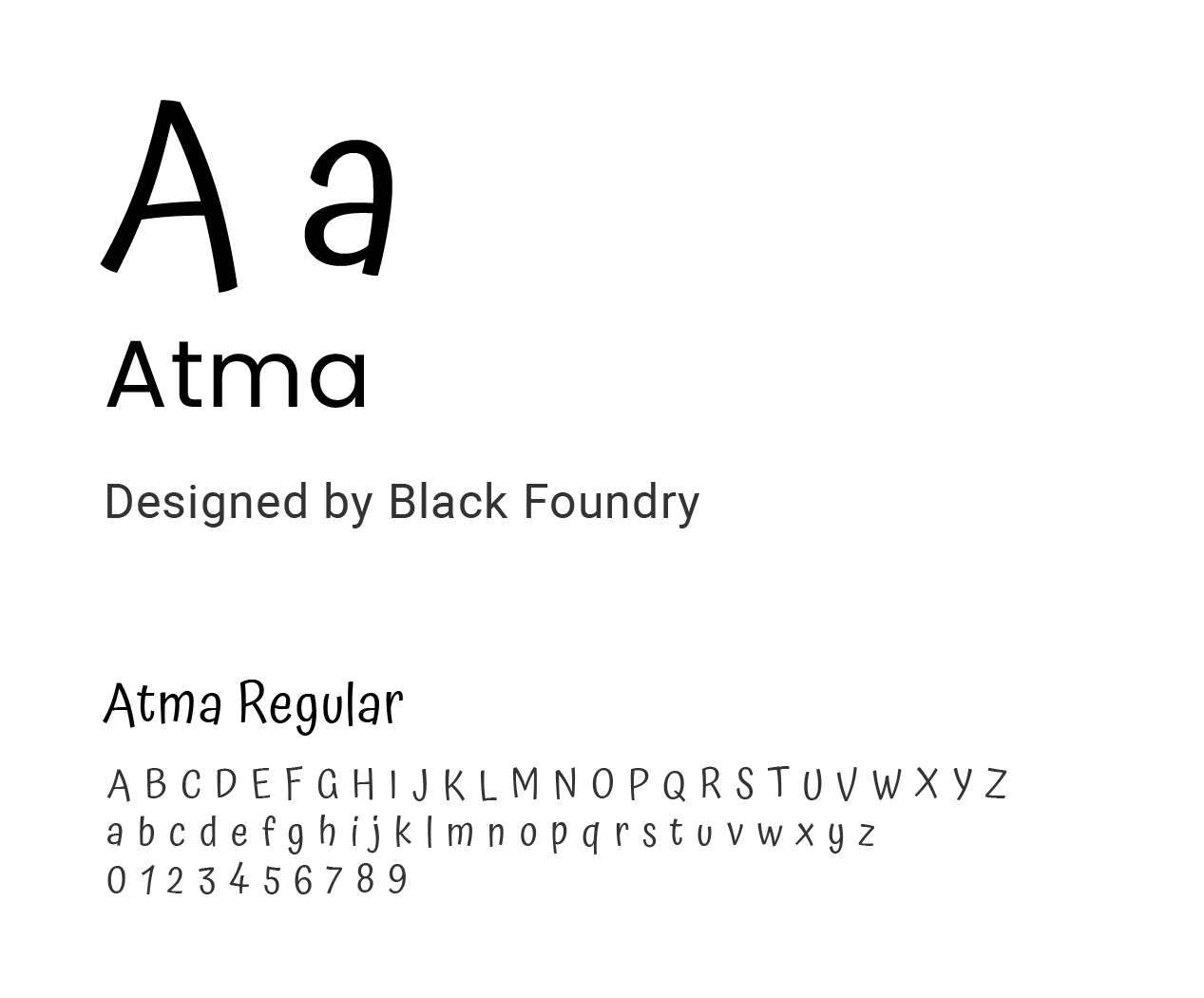
The website’s content and visual identity were defined to reinforce a healthy, from-scratch cooking concept. A warm yet neutral color palette supports readability and brand consistency. Typography combines Poppins (regular and bold) for clarity and hierarchy with Atma (regular) to convey a handcrafted, approachable tone. The logo—Sanus, from the Latin for “healthy,” paired with a spoon and fork—along with the tagline “Sanus from Scratch,” communicates the product’s focus on homemade recipes.

2. Wireframing & Early Validation
Low-fidelity wireframes were created to explore layout options, user flows, and content hierarchy across all six pages. Wireframing enabled early feedback, rapid iteration, and usability testing before committing to visual design, reducing rework during later stages.
3. Visual Design (Mockups)
Wireframes were translated into high-fidelity design mockups that reflected the intended look and feel of the final product. Design decisions focused on consistency, readability, and responsive behavior across screen sizes, ensuring the interface supported both usability and visual cohesion.
4. Prototyping
An interactive prototype was developed using Adobe XD to simulate navigation, interactions, and page transitions. Prototyping allowed for validation of user flows and interaction patterns before development, helping identify usability issues early and align the final build with the design intent.
Healthy cooking, curated and designed for real users.
Healthy cooking,
curated and designed
for real users.
5. Front-End Development
The approved designs were implemented using HTML5 and CSS3, with JavaScript and jQuery added to support interactivity such as carousels, accordions, sortable tables, and lightbox effects. Development was completed in Visual Studio Code, with a focus on clean structure, responsiveness, and maintainable code.
6. Deployment & Version Control
The project was deployed using GitHub Pages, with the codebase managed through a GitHub repository and GitHub Desktop for version control. This ensured transparent iteration, traceability of changes, and a live, accessible product that could be reviewed and tested by stakeholders.
Website
Access the live version of the Sanus website and explore the final design and functionality.
View SanusWebsite
Access the live version of the Sanus website and explore the final design and functionality.
View Sanus